Mad Men Yourself
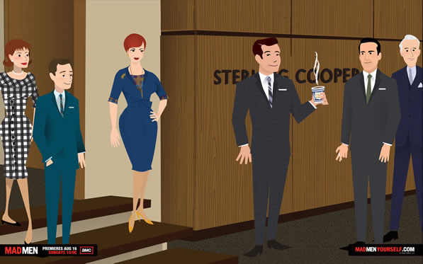
If you’re a twitter-er, you might have noticed my new avatar. Since I’m not photogenic, I took 5 minutes last night to Mad Men myself. Feel free to do your own: http://www.madmenyourself.com


If you’re a twitter-er, you might have noticed my new avatar. Since I’m not photogenic, I took 5 minutes last night to Mad Men myself. Feel free to do your own: http://www.madmenyourself.com


According to the SF Examiner, the going rate for the overhaul of the US Government site Recovery.org is $9.5 million dollars over the next 6-months. Your tax dollars hard at work. I’m holding my breath for the promised transparency:
The silver lining here is that after months of spending, this contract signals movement to finally disclose officially where the money has been going. More importantly, the Recovery Accountability and Transparency Board, which oversees Recovery.gov, has promised to make all of the raw spending data available to the public.
I’d have done it for $7 million.
[Completely design unrelated]
I go to weddings because you’re supposed when you’re invited and because my wife likes them. My aim is to find out early (either pre-wedding or from the itinerary) how long the service will actually be lasting. It isn’t that I dislike them, but like most men, they aren’t my ideal Saturday afternoon/evening outing.
But I could get into weddings if more of them started like this:
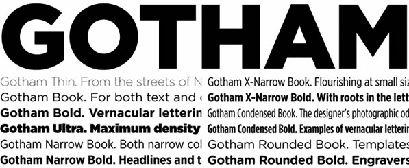
To continue a steady dose of design and/or typography related content recently, I offer up an interesting series I just came across from the new design blog idsgn called Know Your Type.
So far they have done the research of the history and usage of four different typefaces (all sans-serif so far) and presented it in a very well-done manner. A serif font is promised next in the series.

Gotham (made recently popular by a certain Presidential campaign)
(more…)
I don’t hide the fact that Adobe Illustrator and I aren’t necessarily friends. I’ve never been one to have the ability to draw much. And for being a related field, I feel like I should be better at logo design, but it just isn’t my forte.
Which is probably why videos like the following capture my attention so much. It’s 6 minutes long so you might just want to jump through some of it as it goes. It really gets interesting to watch once the logo creation gets started. And jump through to Mattson’s site to see the other renditions and final results.