33 days
I’d tell you to get your TiVo’s set but I kind of enjoy the fact that most don’t watch it for some strange reason. But I will start to wonder how you could possibly not begin watching after seeing the season 3 promo:
I wouldn’t recommend picking it up right here though, do yourself a favor and get caught up on Season 1 and Season 2 while they are half price.
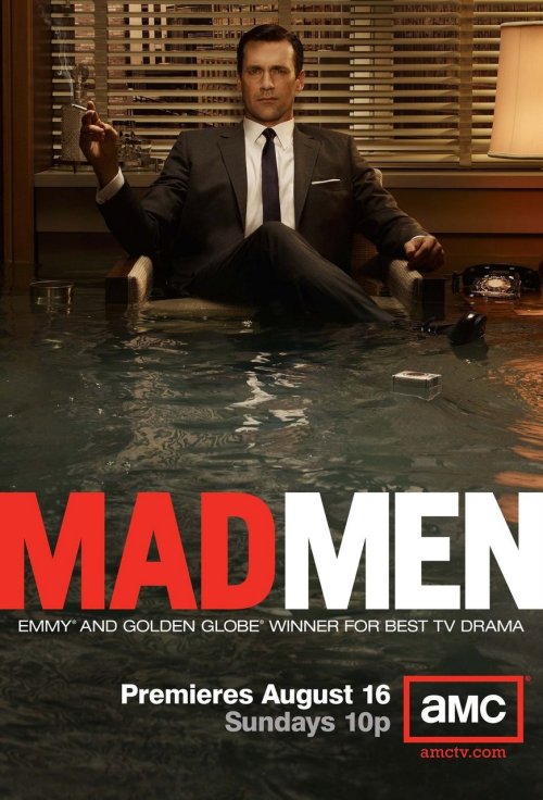
The beauty of the show for me isn’t in the fact that its now won Emmy’s and Golden Globes’, its that I really feel like I’m watching 1960 as it happened when I tune in. The attire, the speak, the excessive cigarettes & booze, the design, the ads, the cars, the restaurants and I could go on and on. I’ve seen JFK get elected and civil rights marches in the south.
The only thing that I’ve ever noticed a bit out of place is the one detail that their designers/period experts have overlooked pretty regularly. Fonts. Not being an expert in font history I will defer to guys like Mark Simonson to go into detail but there are several times I have noticed them using fonts that didn’t actually exist at the time. Their biggest mistake? Arial for the closing credits. Ouch. I hope they fix that this year.
If you’re a design nut or just a fan of not-the-highest-of-quality-tv-drama, catch up. If not, well, just ignore any future raves I will eventually spit about the show.
If for nothing else, so that I have record of it and a reason to listen to it to get me pumped, the opening credits:
Yeah! Can’t wait!