The Overhaul: Gunnison Valley Health System
“Case Study” is an oft-used term by many design firms as a part of (or in lieu of) their portfolio of work but I would consider it mostly misused in each situation. A case study, as I understand it, comes from the field of science or research that usually includes experiments, surveys and/or analysis on data gathered from individuals or groups. More often than not, a “case study” seen in the standard web portfolio hasn’t been research, tested or evaluated and just gets labeled as such as a fancy word for portfolio piece.
It doesn’t matter much, other than as I set out to pen a few short thoughts on a recent re-design I offered for a client I struggled with how to label it. It isn’t an actual experimented case study since I didn’t test it against anything other than my own collected knowledge of UI and design preferences, but it is a review of where it currently sits and where I envision it going as we move forward.
My current interest in gaining new knowledge about my craft has been leading me down the path of realizing that part of my job as a creative is to use design to solve problems. While dressing things up is the fun part and the part that gets noticed the most, there are plenty of underlying things that feed into the overall look and functionality of the site.
My job is to make you look better but if in the process of making you look better I make your site unusable for clients and kill your sales, I haven’t done you any favors nor do I have a leg to stand on as an “expert” down the road. Included in the fact that I need to make your site pretty and you happy, I have added responsibility to provide the best experience for your users through things like predictable navigation, color/font consistency and organized content just to name a few. Throw in a couple of Make My Logo Bigger cream requests in there and you can ultimately see that there is a need for more learning in the problem solving category on my end.
Enter, Gunnison Valley Health System.
GVHS is an inherited design from a previous designer and is a number of years old. I can’t speak for the original designer but am guessing in its initial form/launch it was good for its time. Web standards weren’t adhered to in years past like they are today so there are many back-end issues that it faces but where it falls short today in my opinion is what it has become.
Since the launch of the original website, the client has grown from a single hospital to a network of medical facilities ranging from nursing homes to home health – which is great news for the client. The problem lies in the fact that instead of growing their online presence simultaneously with their actual business, they attempted to just force more content into their same online home. After recent discussions with them, a decision was made that some small design changes would need to be made. Not being able to settle for some small tweaks, I forged ahead with a vision of where I see them going forward. A design that not only updates their look but organizes their content in a way that makes it much more accessible to their users.
This design has been presented to the client and will probably spend some time in revision with the client before it comes to life on the web. My goal here is to show where design can and should be used to solve problems; most of all in this case the re-organization of content to differentiate exactly what the GVHS network does and how to best present that information to users.
Since the current version of the site is still live, there isn’t as much of a need for screen shots but hopefully it will change at some point and these can serve as record keeping of the old.
The old: Drawbacks
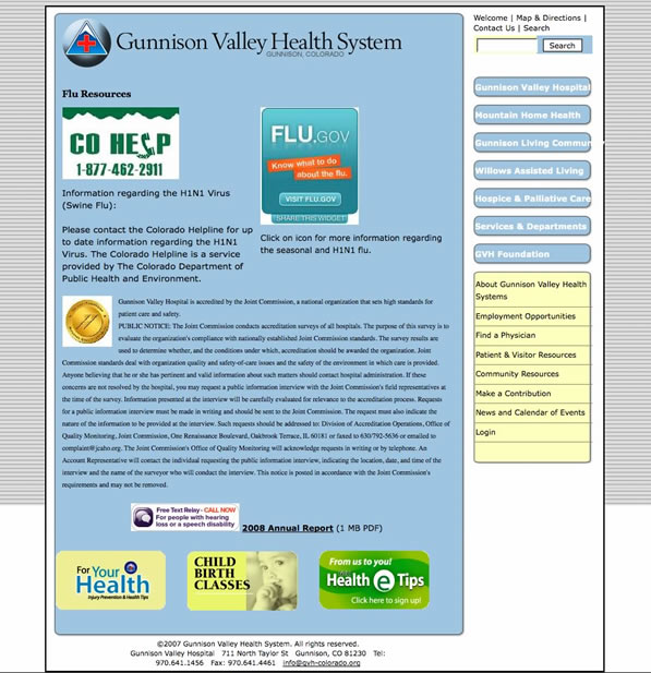
- Skinnier width of entire site makes it difficult to have both content and sidebar and allow room for each to fit nicely (see overrun on navigation items)
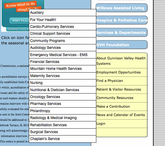
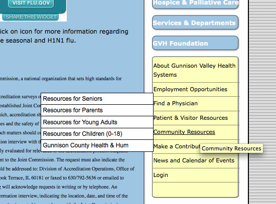
- Sidebar has three separate navigation areas: above search, blue buttons, yellow buttons. Sections have been inserted in the wrong navigation areas and there is no explanation of what each is actually for.
- The programming is outdated and has flaws including simple fixes like the white space in the background where the image cuts off.
The old: Positives
- Plenty of content to work with
- Quality of existing content is relevant and good for what they do
- Consistent colors, logo and feel to work with
The old: Screen shots
Views of over states with each navigation area:


The new: Problems solved
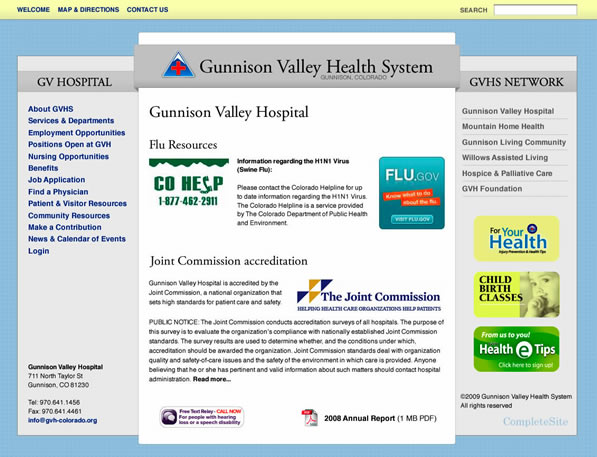
- Organization of content into separate sections: Hospital information in left column while network facility information in right column.
- Much wider site that allows for 3-column layout while still allowing for a nice center column width keeping the content lines somewhere around a readable 75 characters.
- The ability to keep the same color scheme and branding that they have used across the board for each of their facilities while updating the look with a more contemporary feel.
The new: Presented design
I hope that the client sees the importance of the re-organization of their content and that ultimately their users are the biggest benefactors of the whole process. We’ll see. If it moves forward, hopefully we can track and watch the differences in what actually gets viewed and works well which would ultimately turn this into a full case study.
Feel free to put me in my place below.


Awesome explanation of the ‘real reason’ for a business to have a website — getting information to your site visitors, without confusing or insulting them. Nice work!