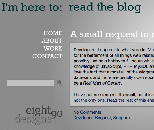
Due to the fact that its Sunday night and I didn’t want to sit still, and the fact that as I peruse my stats on the back-end I see that exactly 18.1% of you are still using IE6 (shame on you, by the way); I went ahead and made some adjustments this evening.
For my IE6-ers: Sorry it has taken me almost a week to get you in the realm of a decent experience. Piggybacking off the always-handy jQuery I was already using, I fixed some of the transparent PNG issues you would have seen and then replaced some of them with standard JPG’s so that the level of visual funkiness isn’t quite as bad as before.
I do it cause I love you, because I assume that you are trapped by some corporate structure that doesn’t allow an upgrade, and because its my job to not leave you behind. Even though on occasion I want to badly.
For everyone: I have finally put together a decent collection of things I have created over the last couple of years. To be honest, I’ve done somewhere in the neighborhood of 75 sites in the last four years so this really only scratches the surface but it should give you an idea of what I produce.
There are plenty of works I’ve produced out there that I’ve done merely for the cash thus vowing to never tie my name to them in any way. Like most in my field, I have dealt with the occasional client’s wife as the design driver and even had to mix in some pink polka dots here and there. Needless to say, those projects probably won’t be showing up here.
I’ll do my best to update the portfolio a little more regularly but I make no promises.
As always, a day or two late is the norm.
For those of you using a feed reader, you might want to at least click on through to see the newest version of my site.
It’s late and I don’t feel like detailing a bunch of things but here just a couple of highlights:
- Almost monochromatic color scheme with just a couple of touches of blue (#033) here and there.
- Left-aligned with fixed position sidebars on both the left and right of the content. More to come on the right side down the road.
- A wider content area so you will see some goofiness in older looking images/videos but new content will be adjusted accordingly
- Font replacement for headings, titles and main navigation through Cufon. You’ll probably noticed a slight delay/change from time to time as it gets replaced. It isn’t the perfect solution but until the much awaited Typekit drops, it’s the best option.
I haven’t even thought about validating or punishing it yet, so be kind. I’ve done some browser testing: FF3/Safari 3 on Mac and IE6/7/8 & FF3 on the PC but make no guarantees that it displays perfectly on your end. IE6 users, I didn’t drop you completely as some do but I also didn’t take full care of you either. You’re going to see some funky blue rings around several places and that’s just your browser doesn’t handle transparent images. There are fixes (and I might implement) but I’m too worn down tonight. As always, you’d be better served to upgrade your browser and browsing habits.
If you see some wackiness, feel free to comment below and embarrass me in front of my friends/family or save my ego by shooting me a note.
Up next, a revamped portfolio and some links to some fresh work.
Here’s to hoping the relaunch spurs a little creativity in writing as well. Daddy needs a new pair of shoes.
If you happened to stop by anytime this evening you might have gotten a sneak peek of v3.0 of my new site. It’s close, just not quite ready. A few nuts and bolts still need to be tightened and a few leaks need to be plugged, but it’s close.
Fingers crossed it’ll go live before Monday. And since you asked nicely, a quick look to whet the appetite.

When I am slightly more coherent, my plan is to make a little bit longer of a write-up. Until then, welcome to my new Internet home. It has been a long time coming. Far too long. The freedom I speak of was the ability to create what I wanted, exactly the way I wanted it. I was the client.
The quick skinny:
- Built from the ground up. No template here.
- Minimalist design with the possibility of small tweaks coming here and there.
- Haven’t even touched IE6 yet to test. Please don’t look at it in IE6. Better yet, quit using IE6
- No, your eyes aren’t bugging out, the posts actually fade in color as they get older.
- Fair amount of JavaScript, CSS, JQuery and magic dust to get everything the way I wanted it
- More changes likely. It was at a usable stage and I was tired of the other one, so I posted it.
(more…)
